 RSS
RSSArt Breakdown: Cardgame Hacking AN 2026 Pack
12 September 2026

This year I decided to come back and make a new set of cards, which will be available for purchase if you are in person at Worlds this year! And if you're not, you'll be able to buy them online from my store shortly after Worlds is over. I want to break down my process for this, what's involved, and how I got where I am.
But first, let's rewind to 2025, and see what I did last year.
2025 Cards
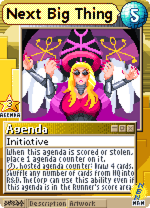
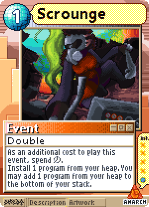
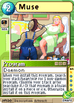
In 2025 I made alt arts for three cards: Muse, Next Big Thing, and Scrounge. At the time I didn't blog in-depth about it, which I've since learned people actually might be interested in! So we're going to skip back and talk about those briefly.
General Features
Looking at these cards you can see lots of details that are unique, and a clearly Windows-inspired design sensibility. I like to coin the term "post-Y2K" for this aesthetic - somewhere between the User Interface guidelines of Windows ME and the graphical fidelity of Windows XP. A lot of these elements look like classic Windows fonts. They were used for a base, but it's important to remark that even at this point, I am not using a font package for these cards. I have drawn my own font roughly based on rudimentary rendering of various windows fonts, but adjusted for the readability and style I desire.
The background is actually loosely based on a previous Netrunner Alt Art I drew, a faction-bent version of Spark Age designed for the Haas-Bioroid world. I'm enamored with the mix of orbular and rectangular shapes in a background and attempted to pull it through here. I didn't like what I ended up with, in the long run, as will soon be apparent. I redid this background for my 2026 set, and am re-releasing these cards with it using the new background.
The first edition of these cards had a critical error which some judges pointed out after a tenth pair of eyes looked at them: I hadn't actually placed the original influence counter in an appropriate location, and so the cards weren't technically tournament-legal. This was since corrected on the second edition of the cards, which was available for purchase on my shop. A third edition will be available shortly, with the cards further updated to the new standard of my 2026 cards.
Muse
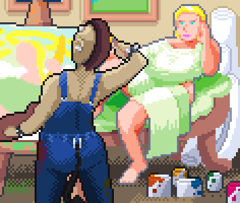
Muse seemed like a fairly obvious pick for me. I decided to depict a blonde lady as the subject as a nod to my partner Juniper, who works with NSG on Netrunner and like me is vain enough to enjoy being a muse. The painter wears a tail clipped to their belt loop, which is modeled after a real tail that I myself wear. It's a cute scene nodding to the providence of the cards: I enjoy painting things I think about, and people I think about. The painter's painting depicts the subject as an angel, reflecting how I perceive my partner Juniper as angelic even if it may not be physically visible - painting is an art which can reveal our inner perceptions.
Next Big Thing
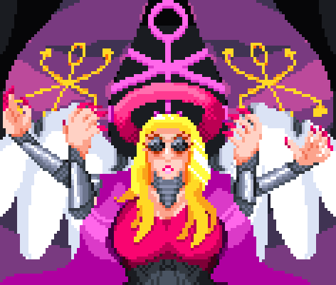
This is another card which rather overtly depicts Juniper in some way or another. This was actually drawn at her request, as she wanted an alt for a card she frequently uses that would depict a cyborg version of her angelsona, giving something akin to a church sermon.
Back in 2021 when we were first hanging out, I drew up a sigil that I thought would fit some concepts she gave me. That sigil never really got used for anything, but I've thought about it occasionally ever since, and so finally got to use it in this form. It became the symbol in the background of this church.
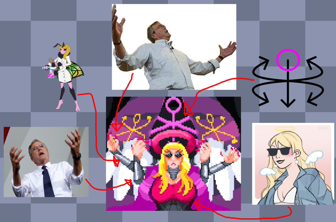
The other subtle detail to this piece is that the positions of her four arms are based on a composition of two seperate images of infamous political figure Jeb Bush. The usage of Jeb Bush here is primarily because I find him to be a loser failson that is funny to reference. The image of his arms spread wide and encompassing is common and I figured it might catch folks' eyes subconsciously.
Scrounge
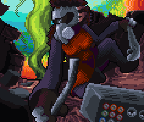
I think scrapping is cool.
2026 Cards
And now what you've all been waiting for! My new set of cards... Alarm Clock, BANGUN: When Disaster Strikes, Cookbook, and Spin Doctor!
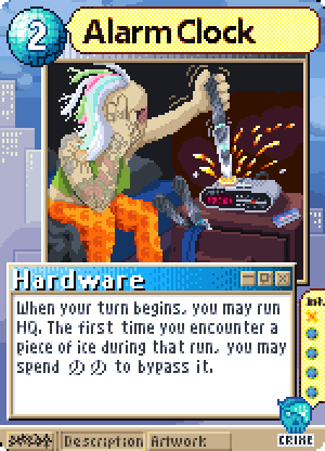
You can see a continuation in my design sensibilities in the four cards I've chosen this year, plus some small changes. I've updated the background to better reflect where I am in my artwork, and I feel much more proud of how it looks. I've also continued to do a lot of manual typography and my own bitmap fonts. What that looks like might need a bit of explaining, so let me break it down, and also a major change I made in this run of printings.
Typography
Generally when you write text you'll have some sort of text box, you select a font, style, and size, and then you can type whatever. On the inside these fonts are vectors, which means that you can scale them up and down without them losing their shape.
This has advantages and disadvantages. When creating a final product, like cards for a game, you end up having to print them, and at some point you can't keep storing them as vectors. You'll have to translate them from vectors into rasters - you'll have to "set" the shape to the nearest pixels. This is fine in any reasonable screen size nowadays. However it doesn't normally play nice with pixel art.

The sizes that I'm doing my art at are so small that vector fonts become blurry messes. This not only is poorly readable but simply looks bad. The aesthetic quality of the typography is completely lost as it squishes. So instead of letting that happen, I'll usually take a simple vector font at a small size, and then use that as inspiration to draw my own fonts from there.

As you can see here, I've created five bitmap fonts inspired by the Windows-packaged fonts Courier, Arial, Segoe, and even some completley original glyphs. I plan to release these bitmap fonts once I'm done them, but if you wish to spin something up off these go ahead.
These fonts I arrange in a spritesheet for use with the excellent Bitmap Font Writer program by Stefan Pettersson. This program allows you to write out a block of text, open up a bitmap font, and immediately render a sentence that you can copy and paste in any bitmap editing program. I then paste the output into Aseprite, where I do additional tweaking.
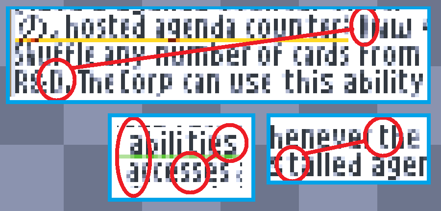
These tweaks are all over the text on these cards, and too numerous to exhaustively list. However, here is a selection of them for you. You can see how in some cases to fit text into sentences I shorten letters, or lighten bordering pixels to allow narrower space.
This all does suffer some problems, however. Namely, we discovered after my first printing that a couple tournament operators were concerned about the readibility of some of the cards, because they could not tell at-a-glance what the text was saying. This proved a hard puzzle, because the suggested solution was to "use a more readable font" - obviously that would work for a traditionally-drawn card... but these aren't traditionally drawn. See, the cards are fully drawn at 178x236 pixels, so they can exported at 10-times upscaling for printers. This is because I am an ardent hater of mixels, and want to make sure the entire card perfectly aligns in its pixel art.
I could theoretically export to 10-times scale, then write all the text in... but this would look bad. I could do this on the flip side of the card, but then people might accidentally play with the ugly side because you might confuse the sides at first glance. But if I can make it abundantly clear which side is meant to be played with, and which one is meant for clarification, then that solution does work. So what I ended up doing was creating a clarification side on each card with a readable font and washed-out monocolours.
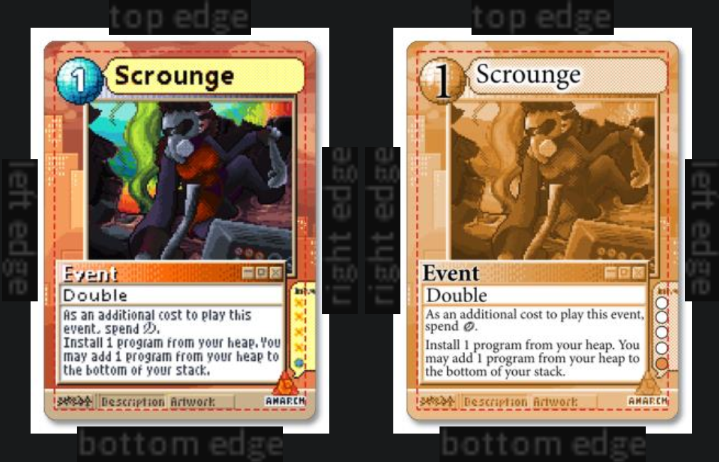
Going forward all my cards will be sold in this manner, with a pure pixel-art front and a higher-readability back for competitive play.
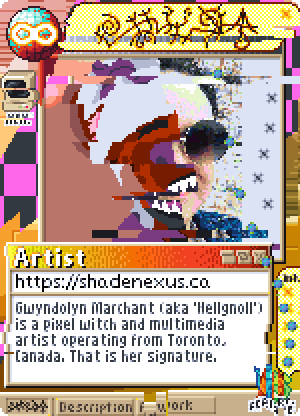
Artist Card
I've long been fascinated by glitch art, and have dabbled a few times with it in the past. But I never quite managed to figure it out in a way I was happy with, because I felt like I couldn't intimately get into the medium I'm glitching. Weirdly enough, glitch art feels incredibly organic to me. In the past my attempts always felt stiff.
When we were discussing selling my set this year, Juniper remarked that it's common for artists to have business cards or even art cards that you can insert in with a set. So if you buy my cards, you also get an artist card! This idea fascinated me, but also presented an interesting factor to me: Very few people in this scene know me personally. Aside from a few NSG folks I know behind the scenes, I don't really hang out in streams or on Discord. In general I loathe Discord, so I don't really exist in most social scenes with Netrunner players.
If you know me online you probably have seen either my fursona (all over this site!) and if you know me offline you know what I look like - I'm notoriously fashionable and recognizable. If you follow me on social media you may even recognize my selfies. If you know me in person or online you probably know me by my name, but if you only see me in Juniper's streams you'd probably recognize me by my fursona's handle (Hellgnoll (full name Billie Hellgnoll)).
I wanted to have all these elements present on the card, and I also wanted to get really deep into the guts of the art for this. This is not a playable card, and I wanted it to be clear it should not be played, while still recognizably part of the set.
So I stuck my hands deep in the guts of my own art and rearranged it until it was a brand new vibrant shape, something glitchy and ephemeral and evocative.
Alarm Clock
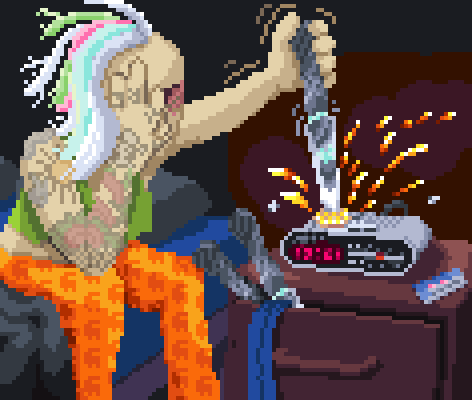
This card was really fun for me as it was actually a prize for a tournament! Juniper ran the Off Meta Month: Costume Party tournament last year, and as a prize was giving out copies of my 2025 set - with an additional grand prize of deciding on an alt for this year's set! The winner was Maparali, with the deck MaxX StabB. And so, after the tournament, I was delivered the specifications for the prize:
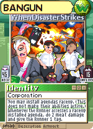
BANGUN: When Disaster Strikes
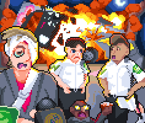
BANGUN is the first corporate identity I really liked, providing a fascinating ability to play agendas face-up in exchange for more methodical (and less obfuscated) play. The corp's concept is iconic too: they're a disaster response team which also just-so-happens to usually cause the disasters. They're the cleanup crew, the mop, and also the cat that shatters the jar of pasta.
One of my favorite TV shows is It's Always Sunny in Philadelphia, which last year aired an all-time episode in my opinion: Mac and Dennis Become EMTs. In it, Mac and Dennis witness an EMT save the life of somebody in their bar, and become thrilled by the idea of having control over life and death like that. They become paramedics, although in usual Sunny style they end up causing more harm than helping. This culminates in a situation where
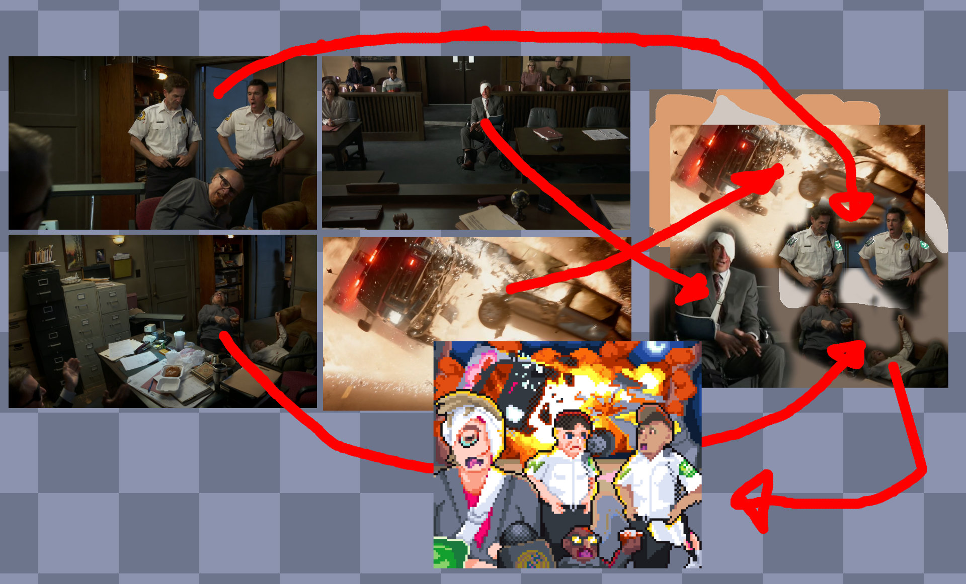
Showing this off to friends resulted in a variety of snorts, chuckles, and cries of amazement. Once you know it's there, it becomes a hilarious hidden layer, and I look forward to playing with this card myself in the future!
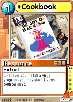
Cookbook
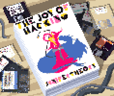
The most important cookbook in my closet is The Joy of Cooking. If you do any serious amount of cooking in North America you've probably at least bumped into the book once. It's one of the best-selling cookbooks in America and has nine editions.
But did you know it has the most fucking crazy-good original cover? Simon & Schuster republished a version with a fascimile of this cover, and I desperately want to replace my copy with it.
To make a brief tangent about my appreciation of this outfit, I want to focus on a couple details that Wikipedia mentions:
The book was illustrated by the author’s daughter Marion (...) she made a papercut depicting Saint Martha of Bethany, the patron saint of cooking, slaying the dragon-like Tarasque.
Rombauer's children, Marion Rombauer Becker and Edgar Roderick ("Put") Rombauer, Jr.,[4] encouraged her to compile her recipes and thoughts on cooking to help her cope with her loss
A fair reading I make of this is that this first edition cover is representing the power of cooking to tame the emotional dragon of grief. I think this is an immensely powerful and extremely cool piece of artwork! Once I found this piece of art I knew I had to use it as inspiration for my version of a cookbook for Netrunner.
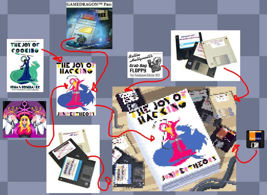
The image itself is a very collaged piece, combining real photos, pixel art, graphic design work, and references. I used two photos of floppy disks from my grandfather, and an old piece of pixel art referencing the famous Ram Doubler application. I also threw in a reference to a fundraising floppy I distributed in 2023 to help my partner Natalie move out of Texas.
The Joy of Hacking cover is itself made of three major components: 1) The original Joy of Cooking cover is the style influence for this pieces. 2) I brought back the angelic pastor version of Juniper from my Next Big Thing artwork. 3) I recreated the cover art of the GAMEDRAGON™ Pro from its official card as the shape of the dragon which Juniper is slaying.
These then all composite together in the final piece, which looks almost photographic due to its combination of collaged elements.
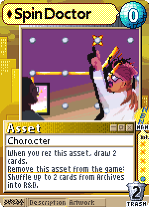
Spin Doctor
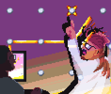
This one's actually incredibly straightforward. A while ago Juniper and I played an old Mac game called Spin Doctor on stream, and Juniper joked it would be funny to make an alt art about it. So I did.
Wrapping up, where to buy, etc!
If you are interested in buying my alt arts they will soon be available for purchase on my MakePlayingCards store. The 2025 cards are getting a 3rd Edition to bring them up to the standards of the 2026 set, and I'll be releasing both on my store after Netrunner Worlds 2026 is complete!
If you're at the Worlds event this year, you'll be able to buy them from the artist's colony! Please do! Buying my cards really helps my art prove itself, and if I get to see them in play anywhere I'll be proud beyond measure!
The process of making these cards has been nothing but excitement. I've always loved playing cards, card games, and graphic design. Joining all these with my pixel art has not only been an exciting challenge, but deeply fulfilling. I look at my 2026 set of cards and I see art which is undeniably my own and also of a quality I never quite realized I could reach!
I want to make more of these. I want to keep producing these Netrunner cards, to keep expanding my set of alt arts for the greatest cyberpunk card game of all time. I hope you'll come with me.